
What is Bootstrap? Learn From Basic with Examples
Bootstrap is the most popular HTML, CSS, and JS framework for developing responsive, mobile-first projects on the web. with bootstrap, you can design a responsive template faster. you don’t need to code a lot of CSS coding because bootstrap itself has CSS coding, you need to call its class name. if you want to design a template so simply include CSS and JS links of bootstrap into your HTML file. bootstrap makes your work easy you can design a template for Tablet, mobile, and PC. as you know in the 21st-century people are using the device more than Computer they check everything in a device so you need to design responsive websites. to increase viewers on your websites.
In this article, you will learn how to start with a bootstrap framework. web designers and web developers should know bootstrap because they need it during his projects. you can’t develop any website without its responsive mode if your website is not designed in a responsive mode so think that it’s useless. so let’s start
What is HTML5? With full Definition, Tags, and Example 5 Best HTML Editor in 2019
What you will learn?
- History
- Download
- Contents
- Layouts
- Components
- Start with Bootstrap
- First Project with Bootstrap
1. Bootstrap History:
Mark Otto and Jacob Thornton developed Bootstrap at Twitter as a means of improving the consistency of tools used on the site and reducing maintenance. The software was formerly known as Twitter Blueprint and is sometimes referred to as Twitter Bootstrap.
2. Download Bootstrap:
you can download the bootstrap from three ways in your PC.
- npm
- CDN
- Source
npm:
install Bootstrap in your Node.js powered apps with the npm package:
$ npm install bootstrapit will install all bootstrap files including CSS and JS file. just you need to run the above code.
CDN:
if you don’t want to download bootstrap file so simply insert CDN link on your projects
<!– Latest compiled and minified CSS –>
<link rel=”stylesheet”href=”https://maxcdn.bootstrapcdn.com/bootstrap/3.3.7/css/bootstrap.min.css”>
<!– jQuery library –>
<script src=”https://ajax.googleapis.com/ajax/libs/jquery/3.3.1/jquery.min.js”></script>
<!– Latest compiled JavaScript –>
<script src=”https://maxcdn.bootstrapcdn.com/bootstrap/3.3.7/js/bootstrap.min.js”></script>
include this links inside <html> -> <head> links </head>.
<!DOCTYPE html>
<html lang=”en”>
<head>
<title>Bootstrap links</title>
<meta charset=”utf-8″>
<meta name=”viewport” content=”width=device-width, initial-scale=1″>
<link rel=”stylesheet”href=”https://maxcdn.bootstrapcdn.com/bootstrap/3.3.7/css/bootstrap.min.css”>
<script src=”https://ajax.googleapis.com/ajax/libs/jquery/3.3.1/jquery.min.js”></script>
<script src=”https://maxcdn.bootstrapcdn.com/bootstrap/3.3.7/js/bootstrap.min.js”></script>
</head>
<body>
Source:
you can download the bootstrap source from this link Download Bootstrap it includes all files of bootstrap that you will need during your projects. so include the links on your project that you need.
What is the PHP Language? and How to start with the basic code of PHP?
3. Bootstrap Contents:
once you download bootstrap then unzip the compressed folder then finally you will see these files.
bootstrap/
├── css/
│   ├── bootstrap-grid.css
│   ├── bootstrap-grid.css.map
│   ├── bootstrap-grid.min.css
│   ├── bootstrap-grid.min.css.map
│   ├── bootstrap-reboot.css
│   ├── bootstrap-reboot.css.map
│   ├── bootstrap-reboot.min.css
│   ├── bootstrap-reboot.min.css.map
│   ├── bootstrap.css
│   ├── bootstrap.css.map
│   ├── bootstrap.min.css
│   └── bootstrap.min.css.map
└── js/
    ├── bootstrap.bundle.js
    ├── bootstrap.bundle.js.map
    ├── bootstrap.bundle.min.js
    ├── bootstrap.bundle.min.js.map
    ├── bootstrap.js
    ├── bootstrap.js.map
    ├── bootstrap.min.js
    └── bootstrap.min.js.map
these are those files that simply used the most and each file works different and it has a different class name. include it on your project file and call its class name. remember bootstrap css won’t work without bootstrap js you have to include css and js links both.
What is CSS? Cascading StyleSheet With Full Details and Examples
Bootstrap Supports Browsers:
bootstrap support various browsers which are Chrome, Firefox, Safari, Edge, Explorer, IOS, Andriod, and Opera. you can run your website in these browsers you won,t face any kind of problems because bootstrap supports these browsers.
4. Bootstrap Layouts:
In here you will learn about bootstrap layouts as it has different layouts here are the details.
1. Grid System:
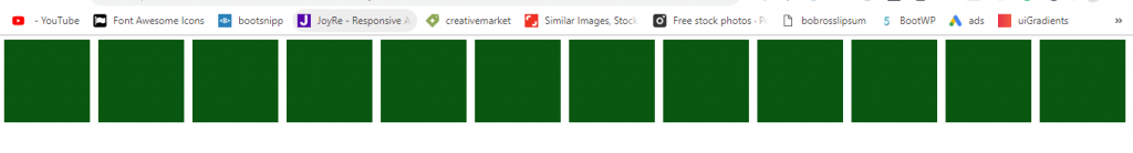
as you know bootstrap makes our work often easy and it has a different grid system (col system) which you need the most during your project. and those grids are responsive you don’t need to use media queries for them. and there are five total tiers (xs, sm, md, lg, and xl).
here is the usage of the grid.
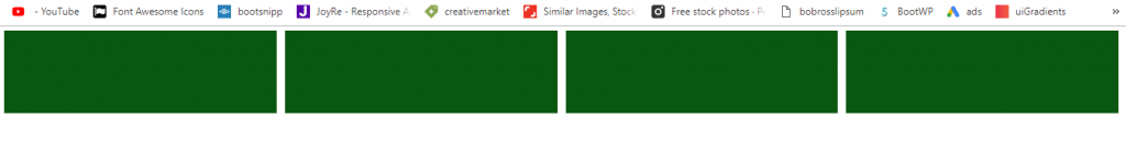

2. Container:
Web designer and web developer mostly use the container for their contents. as you know the width of a page is 100%. so while you use the container so your content gets space of 80%. if you use 100% width so your content looks bad in a browser so you need to give space from left and right side of your content in order to look nice. here is an example of a container and how to call container class.
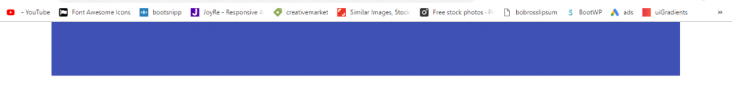 or use .container-fluid for full width here is the example.
 so this was about the bootstrap container and container-fluid. programmer virtually use this class for his section. because it makes the section or content look nice.
3. Bootstrap Breakpoints:
as bootstrap developed for mobile, tablet, and Smartphones. so here are media queries which are most useful for a responsive mode. through media queries, you can handle the layouts in the minimum viewport and make your content in responsive mode also.
Bootstrap primarily uses the following media queries range or breakpoint in our source.
// Extra small devices (portrait phones, less than 576px)
// No media query for `xs` since this is the default in Bootstrap

// Small devices (landscape phones, 576px and up)
@media (min-width: 576px) { ... }

// Medium devices (tablets, 768px and up)
@media (min-width: 768px) { ... }

// Large devices (desktops, 992px and up)
@media (min-width: 992px) { ... }

// Extra large devices (large desktops, 1200px and up)
@media (min-width: 1200px) { ... }
you can manage your layout viewport through this media queries range as given above.
5. Components:
Bootstrap has its component with a class name. it has a different component for various layout or various styles. you can use its component on your project by calling its class name. here is some example of the bootstrap component
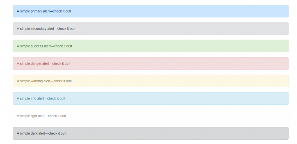
1. Alert:
Provide contextual feedback messages for typical user actions with the handful of available and flexible alert messages.
Example:
you can use an alert for any length of text it is used with button handle mostly. you can call its class name by typing .alert-danger . and it has eight alert class.
2. Badges:
Documentation and examples for badges, our small count and labeling component.
Example:
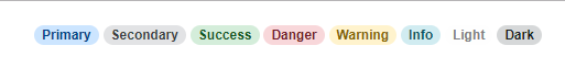
now how to use a badge with content. here is the example.
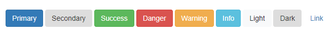
3. Button:
Use Bootstrap’s custom button styles for actions in forms, dialogs, and more with support for multiple sizes, states, and more.
Example:
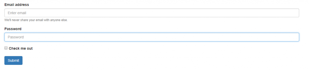
4. Form:
Examples and usage guidelines for form control styles, layout options, and custom components for creating a wide variety of forms.
Example:
6. How to Start With Bootstrap?
now you get somehow about bootstrap. so here, you will get how to start with bootstrap. before starting with it you need to have bootstrap in your PC if you don’t have to go to above on heading 2 and download it on your PC. then you need to create a folder on your Desktop or anywhere you want. (read it carefully) then create 2 folders one for CSS and one for JS and one html file as index.html. after creating your folder and downloading bootstrap on your PC, then put bootstrap css file in your CSS folder and bootstrap js file in your JS folder. then open the folder with your favorite html editor.
now you opened your folder in any IDE then include bootstrap css and js file on your html file.
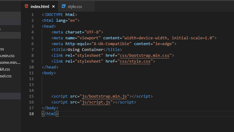
one thing you can include your js file in <head> tag also or you can include it at the last before <body> tag also it’s your wish. but if you include it at the last so it is good. so finally your folder is ready to create the first project let’s start.
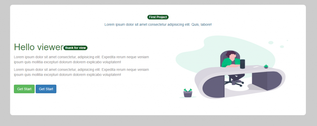
7. First Project with Bootstrap:
let’s do our first project with bootstrap. here I will do a simple bootstrap project for you.
HTML code
Summary:
In this article, you learned about Bootstrap. you learned about its history and how to do download it on our PC. then you learned about its contents and layout as you learned about different layouts. after that, you learned about its component with its example and explanation. then at the last, you learned how to start and create our first project with bootstrap class and its links.