How to Switch to the New Facebook Desktop Interface?
While today, I log in to my Facebook on my desktop after a long time. I just get a new notification that said “Welcome to a Fresh and Simpler Facebook”. Once I clicked the next button, I see the light and dark mode theme option where I can switch between light and dark mode. However, dark mode is more in demand that’s why I go with dark mode. Meanwhile, I see a new Facebook Desktop interface with new features, Text style, Screen size, and many more changes.
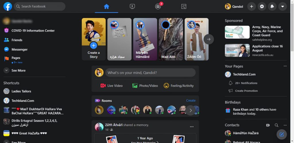
Facebook rolled out the fifth version of Facebook after updating the Facebook Mobile application. The same feature you will see on the desktop interface like Home tab, Watch, Groups, and Gaming menu at the top. Besides that, the story moved to the top and the search bar size comes smaller in the new update. In the new Facebook Desktop interface, you will have three columns and it depends on the screen size. If your desktop screen size is smaller then you will see two columns.
In the first column, you will have a Facebook search bar and more options relevant to your Facebook account. The second column shows the Home, Watch, Groups, and Gaming tab. Under the menu, you will see the story and all shares and posts. In the third column, you have a new menu design that is new in the fifth update. You can access your profile, you can create a new event and you will see the messenger where you can get messages notifications and send messages to your friends. Moreover, you will see the notification icons and account settings.
The new Facebook desktop interface has several new features. If you see the classic facebook design, then the new design is much different then the previous classic design. The icons, text, and screen size come larger which is easy to read and access. Facebook provides you the option to switch to the New Facebook Desktop Interface. If you don’t like the new version then you can switch to the previous classic version. Therefore, if you are curious to switch to the New Facebook Desktop Interface. Then, check this article and follow our steps.
New Facebook Review
In the new Facebook design, you will see several new features and changes. The major feature in the new Facebook is the dark mode. Now, you have dark mode features on your desktop and smartphones. However, while you switch to the new Facebook desktop interface. Then, you will have the option to choose the light or dark mode for your desktop Facebook. Although, at the F8 conference, Facebook owners announced the new plans for Facebook redesigned called “New Facebook”.
The new Facebook design is more friendly and easier to find out the things you are looking for. The update that I noticed, You can access someone’s profiles, message, and send a request by clicking the name of the person. These are the new features of the new Facebook interface. Therefore, the new Facebook design is much better than the previous version of Facebook.
New Features of the Fifth Facebook Update
- Dark Mode: the major update and feature in new Facebook is the dark mode. Now, you can enable dark mode on your desktop or smartphones.
- Light Mode: In the new update, the light mode was updated and it looks more beautiful attractive.
- New Menu tab on the Desktop Interface: The new Design has four new menu tabs that are inspired from mobile applications. These menus were introduced in mobile applications which are Home, Watch, Group, and Gaming. Now, you have these options in the new Facebook interface.
- Messages Icons: The messages section was updated in the new Facebook design. You have the new messages icons and features.
- Larger Text: Facebook updates the text in the new Facebook version. This time, it is easier to read the text as you see the text larger.
- Screen Size: The screen size comes larger than the previous update. The screen size will depend on your desktop screen size.
- Contacts: On the right side of the page you will see the new update called “Contacts”. Here, you will see all your online friends and you can start chatting.
- Access to Someone Profile: In the classic version, while you want to access someone’s profile then Facebook gets you to the new page and showing their profile. But, in the new Facebook, you will see the profile in the pop-up screen with a small size located to the center of the page. Here, you can send a request, send message, and check its profile.
How to Switch to the New Facebook Desktop Interface?
I recommend you to switch to the new Facebook design because this update is easier to use and user-friendly. Several users didn’t get the new Facebook notifications, But, Facebook will automatically send the notification for users to jump to the new update. However, you can switch back to the classic Facebook, if you don’t like the new update. Now. let’s move to the new Facebook desktop interface.
Note: Once you log in to your Facebook account on your Desktop, Then, you will see a new pop-up screen that said “Welcome to the Fresh, Simpler Facebook”. It means you are moving to the new Facebook design. In case, you didn’t get this notification then follow the below steps.
Step 1: Log in to your Facebook account.
Steps 2: Go to Account Settings.
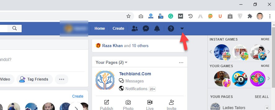
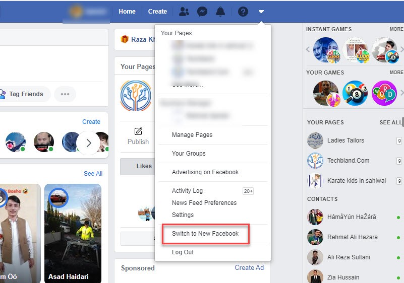
Step 3: Here, you will see the new option called “Switch to New Facebook”. Therefore, click the option.
Step 4: Welcome to the new Facebook interface with new features, new changes, and new looks. You can check all the new settings and new features using your Facebook account.
How to Switch to the Classic Facebook Design?
You have checked the new Facebook Desktop interface features, changes, and settings. However, the new Facebook design is easier to understand and find the things you are looking for. The text are larger, the screen size is larger and much more. In case, you hate the new Facebook design and you want to move back to the classic design. Then, check the below step.
The same method will work for this section. If you want to switch back to the classic Facebook. Then, “go to account settings” and click on “Switch to Classic facebook Design”.
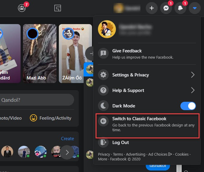
Once you click the option, then, you will see the previous Facebook design. Remember, you can switch to the new Facebook design any time you want. Only use the above steps and get the new design. Moreover, you can switch back to the classic design any time you want.
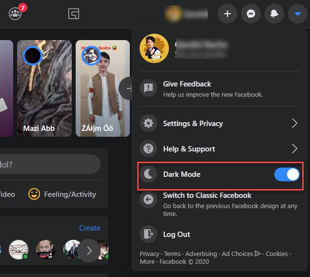
How to Enable/Disable Dark Mode in the New Facebook Design?
The dark mode option comes to several operating systems and in mobile applications. Now, legions of users prefer dark mode themes rather than the light mode. The dark mode is good for eyes and especially while you are using your Facebook at night. Therefore, I recommend you to enable dark mode on Facebook and protect your eyes from the brightness.
you can toggle to dark mode and light mode in the new Facebook interface. If you are in the new Facebook design then go to “Account settings” and toggle dark mode option to “enable/ disable” dark mode.
Read Next:
- How to add Admin on Facebook Page on Mobile or PC
- How to check if someone logged into my Facebook Account
- Best Facebook Video Downloader for Android, iOS, and PC
Conclusion
Facebook is one of the high-demand social media that has millions of active users and billions of users. However, the Facebook owner is trying to redesign the Facebook and make it easier to understand. That’s why the new Facebook Desktop Interface has several new features and changes that look awesome. So, check the new Facebook interface and enjoy using FB.
